A common approach to building web apps in large organisations are theming them for multiple brands. The app will function in the same way but look different for each corresponding theme with alternate fonts, colours and logo etc. This can be a big headache, and you can be left maintaining multiple copies of the same code base. In an ideal world we don’t want to do that.
I found myself at work in this exact scenario. We had a need for multiple themes/branding but at the apps core it had the same functionality. I needed to use the same code base for this ReactJS app. Most importantly I needed to have flexibility and have options to hide and show form fields, components etc if needed for different themes. I also wanted to have an easy way to switch which theme/brand the app was using across the board at the deployment level. So same GIT repository, 3 different deployments (domains), all hosted on Azure.
At work we use Tailwind CSS which is a utility first CSS framework. Rather than making custom CSS classes for each part of a component you are working on, you add multiple utility classes to each element and never run the issue of another developer (or your self in the future) breaking your design. CSS classes stay consistent and in practise I’ve found you only need to add on the off occasion a custom CSS class.
To achieve the theming of Tailwind I used a plugin called tailwind-theme-variants. This allowed me to create 3 variants. We will call them Alpha, Beta, Gamma. Each have there own brand colours. So anywhere through out the application I can prefix the brand name and a colon to a CSS class for example and know it will only be shown for that theme. Just like when using the responsive classes in Tailwind CSS.
<div className="alpha:bg-alpha-color1 beta:bg-beta-color1 gamma:bg-gamma-color1 text-sm">
  My component
</div>
In the example above when the user is looking at the alpha themed version of the app this component will have the background colour of alpha colour 1 (azure). Versus the gamma themed version will have the background colour of gamma colour 1 (ghostwhite). This allows some great flexibility to theme your app while at the same time making it easy to manage.
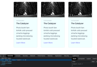
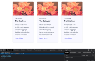
Final result #
First off lets look at the final results. In the screenshots below you can see two identically styled designs of 3 cards. The top one has the alpha theme with a background color of azure the bottom gamma with a background colour of ghostwhite.
Same code base, the only difference between each to get the different results is that an environment variable is different between the two. In this case while developing I have a .env file that looks like this:
REACT_APP_THEME_CONFIG=alphaThe above sets the theme to alpha on build via an environment variable.
Getting started #
To set up your own theme variants for your own Tailwind application we need to first install the plugin:
npm install --save-dev tailwindcss-theme-variantsWe now need to modify our tailwind.config.js file. Add the following at the top.
const { themeVariants } = require("tailwindcss-theme-variants");We can then add our custom theme colors for our individual themes in this case alpha, beta and gamma:
theme: {
    extend: {
        colors: {
   alpha: {
    colour1: 'azure',
   },
   beta: {
    colour1: 'green',
   },
            gamma: {
    colour1: 'ghostwhite',
   },
        }
    },
  },
Followed by our variants, which set what properties we can use these colours for in this example background color, border color and text color. I used a group called ‘schemes’ in this example to not have to write each theme name 9 times:
variants: {
    backgroundColor: ['schemes'],
    borderColor: ['schemes'],
    textColor: ['schemes'],
    extend: {},
  },
Finally the selector for each theme.
plugins: [
    themeVariants({
        group: "schemes",
        themes: {
            alpha: {
                selector: ".alpha",
            },
            beta: {
                selector: ".beta",
            },
            gamma: {
                selector: ".gamma",
            },
        },
    }),
  ],
How it works #
These themes are configured by the root html element having the theme CSS name. In the example below the html tag has the selector class of alpha. The selector class has to be added to the :root or html tag.
<html class="alpha">
  ...
</html>
If you inspect the class with an alpha selector it will look like this in your dev tools when you inspect it:
:root.alpha .alpha\:bg-alpha-colour1 {
  ...;
}
Coming back to my scenario above I needed the same source code to have the ability to use the same codebase but I needed to apply different colours etc (themes) for separate deployments.
Adding a css class via environment variable #
<html lang="en" class="%REACT_APP_THEME_CONFIG%"></html>If you look at the index.html file in the public folder of the example react app, I’ve added an environment variable in the html tag like above. The variable has been set to alpha in the .env file. When the project is run, on build the “alpha” class replaces the %REACT_APP_THEME_CONFIG%.
Clone the project and run the application by running npm run start. Then you can see the results first hand. To set a different theme stop the app and change the variable in the .env file to gamma and run again. You will see the styles on the cards take effect with a different colour background.
The beauty of environment variables is they can be set in a multitude of ways. From command line at build, or via web interface with the likes of Vercel or Netlify. While in development you can update an env file to check your results.
Summary #
Tailwind CSS is a powerful CSS utility framework and extending it via plugins for theme variants allows a lot of flexibility. Especially when you need to re-use code across different brands. Also while environment variables have been around for a long time, they are still just as relevant today in deployment/development. The two together can be a winning combination in your next project.
Hey! Have you struggled with Flexbox layout in Tailwind CSS? #
I know I have. That’s why I created a Tailwind Flexbox Cheatsheet to quickly visually see what classes to use to nail your layout in your own web project.
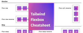
Having trouble with flexbox layout using Tailwind CSS? This cheatsheet can help you quickly find the right class style for your next flexbox layout, with diagrams included.
Pay what you want