In this guide, I will walk you through getting started creating your own UI Component library with ReactJS, TypeScript and Storybook.
You will need Node.js installed as a prerequisite, so install this first (if not already installed).
Open a terminal where you want to start working, we will create a new folder with our new project. We are using Create React App in this example but the steps are similar to ViteJS and NextJS. Run the following command:
npx create-react-app your-ui-library-name --template typescriptThis will use CRA with the TypeScript template to create a new project.
Next we will install Storybook. Make sure you are in the directory that contains your project using cd your-ui-library-name, replace your-ui-library-name with your own projects name.
npx storybook initThis will install Storybook in your project and add some default files.
Let’s get it running so we can make sure the installation went well.
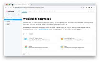
npm run storybookYou should now see a welcome screen in your default browser like the following:
When building a component UI library it’s best to start building the smallest components that will make up the UI library. I suggest starting with some basic components like Headings & Buttons followed by common form controls. The storybook documentation on the welcome screen has a link to a great site quickly summarising component driven development.
By default, Storybook creates a folder called stories that contains component files, stories files and CSS files all matching the appropriate component name. For example header.css, Header.tsx and Header.stories.tsx.
My preference is to instead create a components and pages folder. In the components folder, I will have the component file, the stories file and the CSS module together as they are all part of the whole. I use the pages folder for the top-level components that are used by a router for example React Router. All my other components that are made up of the simple ones are also placed in the components folder, like a login form for example.
We are now going to copy the button.css, Button.stories.tsx and Button.tsx files into the components folder. This is a great example to start with for our Button component. Now you can delete the stories folder created by Storybook.
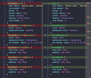
Create React App, NextJS etc support CSS Modules by default. CSS Modules let you use the same CSS class name in different files without worrying about naming clashes. Let’s change this button component CSS file to button.module.css. Open Button.tsx and replace the reference to the button.css file with the following:
From this:
import "./button.css";To this:
import styles from "./button.module.css";In the Button.tsx file you can see the properties for the component have been defined with interface ButtonProps. Notice the “size” with options of small, medium and large. We are going to make some adjustments to the CSS and logic of the component to work with CSS Modules.
Open the button.module.css file and rename the CSS classes from kebab-case to camelCase. We will also rename to a more generic name, by removing the “storybook” from the class names.
Now we need to update the button component with the class names from the CSS module.
export const Button = ({
primary = false,
size = "medium",
backgroundColor,
label,
...props
}: ButtonProps) => {
const mode = primary ? styles.buttonPrimary : styles.buttonSecondary;
let sizeClass = styles.buttonMedium;
if (size === "small") {
sizeClass = styles.buttonSmall;
}
if (size === "large") {
sizeClass = styles.buttonLarge;
}
return (
<button
type="button"
className={[`${styles.button}`, `${sizeClass}`, mode].join(" ")}
style=
{...props}
>
{label}
</button>
);
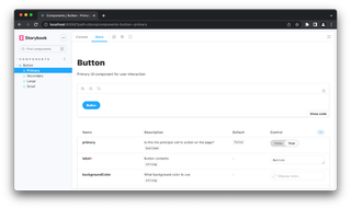
};In your browser, you can now view the “Docs” section for the button with its awesome ability to change properties for your component in real-time. Which is great for testing purposes.
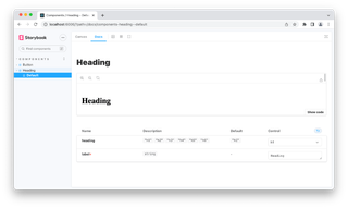
I’ve also added another example for headings, that allows you to select from h1-h6.
Now keep creating more components for your own UI library piece by piece. You can test and check your components in Storybook independent of the web app, configuring all sorts of different property combinations.
If you would like to view the source code for my example it’s available on GitHub.
For more guides on how to use Storybook to create your own UI Component library check out the tutorial section at the storybook website.