Truth be told I fret about numbers. My bank balance, my home data cap, the number of kids in the car is the same as when we left home and my mobile data/minutes caps.
I’ve been a 2 Degrees Customer for over a year and a half now. Their marketing campaigns are funny (with Rhys Darby), I like their fair mobile plans where your data and minutes roll over, you can use your monthly minutes in Aussie and their prices have made the other two big boys drop their prices too. But there is one glaring problem, their iOS app…
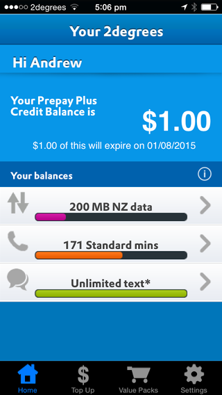
It pains me every time I need to check my account balance. I need to know have I used up all my data? Can I download the latest Angry Birds game in the park? If your like me with an attention span of… What was I writing about? Oh yeah at the moment it takes two taps to know my data remaining or three to know how many minutes I’ve accumulated. It’s just painful, why can’t I see it all on the first screen?
Rather than whine about it (well maybe a bit) I decided to create a slight redesign for 2 Degrees on how I think their app would be so much better. For brownie points I even made a prototype.
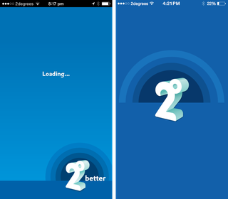
First things first. The loading screen, not much to say here. Some animation of the logo background circles would be nice. Branding front and centre.
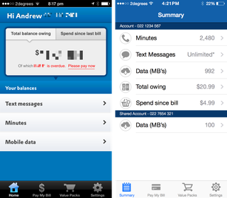
The summary screen. All the most important information you need to know, all I’ve had to do is open the app and I’m presented with this. Minutes, data and even shared data with my iPad. No more having to drill in and back to get an idea of my data and minutes.
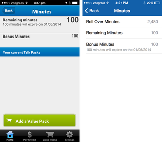
The details screen. All the pertinent information nicely displayed on one screen, that I have drilled into from the summary screen.
Now to see it all in action here is the prototype.
I hope you, like it 2 Degrees. Not only did I enjoy creating this redesign, I got some UX/UI experience, and learnt a couple of new tools (Sketch and Marvel).
Update: Some good news 2 Degrees have updated their app to show a summary on the first page of the app.